The thought process behind wagnertrilobytes.com
October 27, 2025While designing the Trilobytes website, many design ideas had to be incorporated and accounted for....
Read PostWhile designing the Trilobytes website, many design ideas had to be incorporated and accounted for....
Read PostHow I ended up from simply making an HTTP interface to reverse engineering the local firmware of the...
Read PostWhy and how I created a library for vanilla JS for use with the CSS grid. ## I: Freedeck / The Prob...
Read PostThis article is still being written!
This article will explain my thought process behind Freedeck's UI and all of it's interactions with users.
It is no secret that if you want people to use any software, it must be simple to interact with.
This is my first principle: simplicity is key. For an app like Freedeck, this idea is pertinent, although we must still allow power users to access advanced settings.
The perfect balance is hard to achieve.
Freedeck's core idea is simple: be a touch pad.
Thus, the design "language", or how its ideas are communicated is simply that: touch is central to the design flow.
With this in mind, the first thing I did when I started working on Freedeck was mimic the physical object I was imitating: the stream deck.
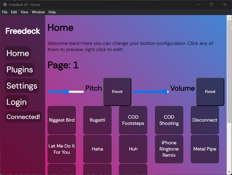
This is the first iteration of the UI with some features implemented. (pictured closest commit: 8d46fb0)
Of course, it doesn't look too great but it sets up the general idea for what Freedeck should be: large panel-like objects and page-based navigation.
Go Back